sub brand concept
SHIELDS Advanced Therapies needed a sub-brand identity that could stand on its own while staying visually rooted in the parent company. The brief was specific: a logo icon built around a shield and DNA strand, with a clean, clinical confidence that reflected the precision of advanced therapeutic work.
PROJECT
SHIELDS Advanced Therapies
[Work provided for an inmotion (Virtual, Inc.) client]
2024
-
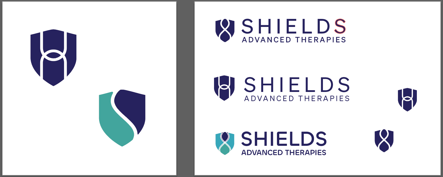
The starting point was the parent brand. The new identity had to feel cohesive with what already existed, not competing with it. From there, the exploration centred on merging two loaded symbols (shield and DNA strand) into something unified rather than literal. Early sketches pushed into both fluid and geometric directions to test which felt more aligned with the brand's tone of clinical clarity and forward momentum.
-
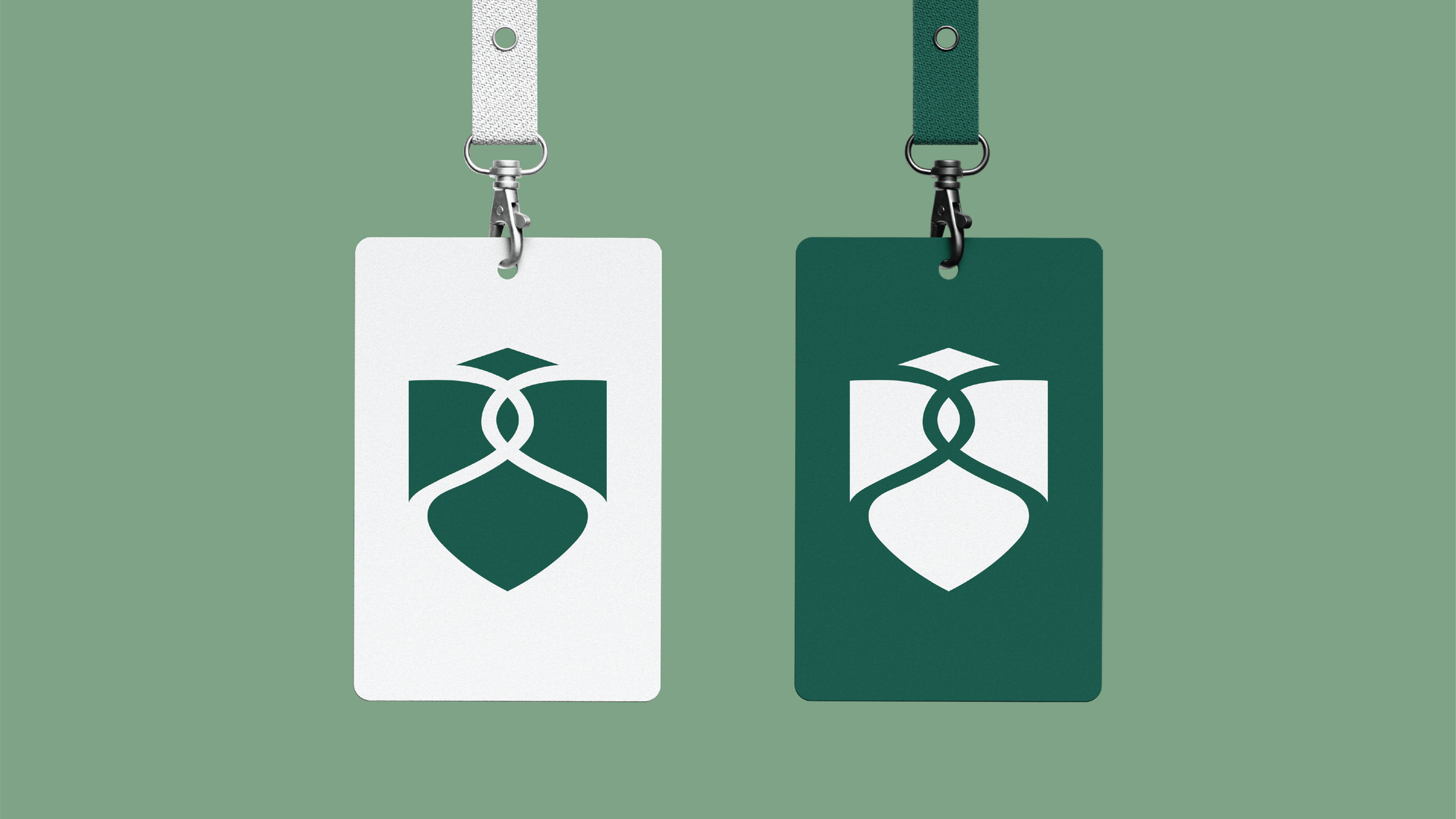
The final icon uses interlocking forms to suggest both the structure of a shield and the double-helix of a DNA strand, with neither symbol dominating the other. A fluid interpretation was chosen over a more rigid geometric approach to give the mark a sense of movement and process, nodding to the dynamic nature of advanced therapies. Colour was used deliberately to indicate a focal point of transition within the icon, reinforcing the science-forward concept visually.
-
Clean greens and blues form the palette, chosen for their associations with clarity, trust, and precision. The tones feel modern without being cold, and sit cohesively alongside the parent brand's existing visual language. Shape language throughout mirrors the flowing, interlocking nature of DNA structure.
-
SKILLS
Sub brand development, logo design, icon design, working within existing brand guidelinesSOFTWARE
Adobe Illustrator, Procreate -
Art Direction: Neil Magadzia
Presentation Design: Neil Magadzia
Concept: Bria Sherman
Graphic Design: Bria ShermanAgency work for inmotion / Virtual Inc.
ideation
original logo
The client was creating a sub-brand of their current company. The new logo icon needed to incorporate a shield and DNA strand but also feel cohesive to the existing parent brand.

moodboard
The colours focus on clean greens and blues, emphasizing a sense of clarity and reliability. Shapes flow and piece together like DNA strands.


sketching & drafts
My sketches and first drafts explored fluent vs more geometric variations of the required shield & DNA strand imagery. Colour was used to indicate a transition or focal point connecting to the processes of advanced therapies.