local Business Rebrand
Case Study: Big Sky Ranch Animal Sanctuary’s original logo does not meet current accessibility needs and could use a fresh update to attract more sponsorship and volunteer participation. By creating a friendly, approachable, yet, professional appearance it would better reach their target audience in the Ottawa & surrounding area of all ages that are passionate about fair treatment and care of animals.
PROJECT
Rebrand for a client of choice with brand guidelines:
Big Sky Ranch Animal Sanctuary
[Student Case Study — Algonquin College Graphic Design]
2020
-
A friendly and fun-focused mood demonstrated by bright colours and rounded graphics. Illustrations that create a feeling of love, care, and connection between animals and humans.
As a branding exercise we were required to complete as many logo sketches and variations as possible within five weeks, with feedback and creative touch points each week. Resulting in two successful options that solve the design concerns of the current logo.
-
The final logo incorporating the human figure was chosen to align wi h the client focus of creating better relationships between animals and humans.
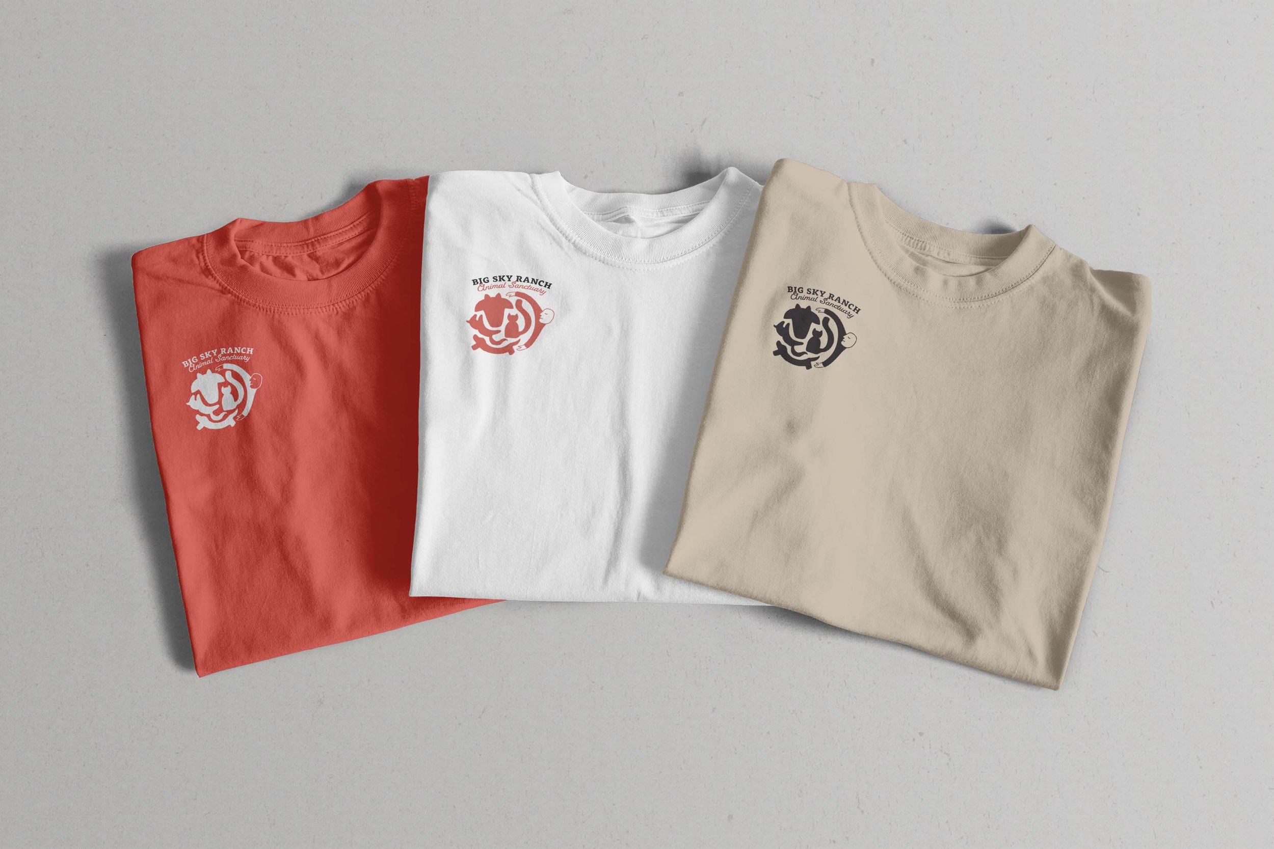
The typeface combination of the wordmark creates a Western ranch feel. The rounded corners of the serif font set a more casual, friendly tone, and the script font pairing adds a fun, lasso-like idea.
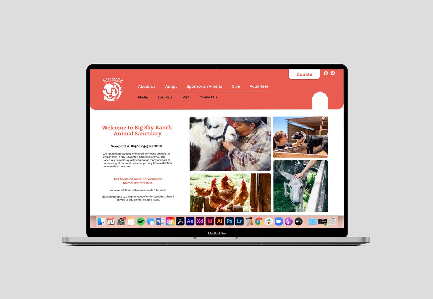
The red barn is a landmark of the sanctuary but it's not the main focus of the client's key messaging — rather than being used directly in the logo, I created a red barn icon to be used across other design elements.
-
Red-orange was chosen as the primary brand colour because of the warmth it gives, and to represent the red barn that is a landmark on the sanctuary property.
To convey the message of Big Sky Ranch accepting a variety of different animals to be rehabilitated, the animal symbols vary from dogs to cows. It also incorporates the theme of rebuilding animal & human relationships. The animal symbols were made with rounded shapes and corners for a family-friendly approach. Although it is friendly, the simplicity of this logo carries a professional tone.
-
SKILLS
Brand exploration
Illustration
Working w/ feedback
Complete brand guideline packageSOFTWARE
Adobe Photoshop, Illustrator, InDesign -
Graphic Design: Bria Sherman
ideation
original logo
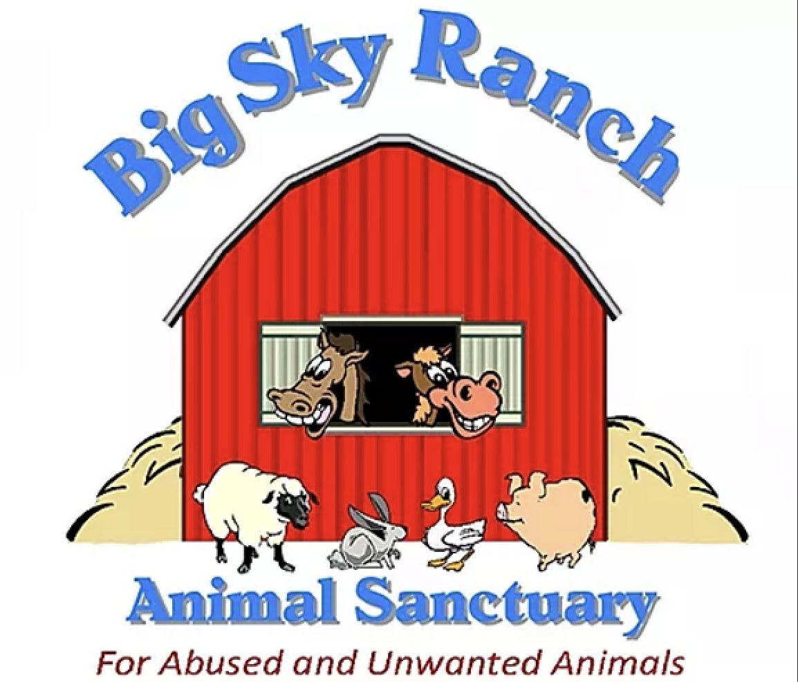
The overall accessibility of the original logo needed help. The shadow effect on the blue text, and the very detailed, multi-coloured illustration makes accessibility and consistent use across print materials especially difficult.

moodboard
Keeping within the primary colour palette, adding fresh energy and organic lines moving though the design. Layered shapes form to create a sense of togetherness.
sketching & drafts
Sketch iterations were deeply explored below. The first drafts focused on an option emphasizing the red barn as the home of the animals, and an option with humans caring for the animals. Both versions focus on togetherness and the colour red which symbolizes warmth, and the landmark of the barn on their farm.